Before & Afters - Discover how we edit!
There is no denying that Helen and Nat love to spend time in Photoshop working away on their creations! Read on as they share some of their Before and After images, and give you a rundown on the different tools they use to create their final edits.
BEFORE/AFTER:


NAT:
This image was really fun to create, and fairly simple! To start with a bit of fun, I added a Zoom Filter to the image and masked out the filter from my son’s face.
Then, on a blank photoshop layer, and using a set of Watercolour brushes, I created a watercolour layer, with splatters, splotches and brush strokes of all kinds.
I then set this layer to a Soft Light blend mode, and also masked out the watercolour layer from my son’s face and body. To finish off I tweaked the colour in Camera Raw using an alternative Adobe Colour Profiles to push and play with the colour further.
BEFORE / AFTER:
HELEN:
To begin, I cropped from the standard 2:3 ratio into a square crop.
Next, the flowers were added as individual composite elements, one to Minnie’s hair and one across the back of her shoulder.
The colour was altered using a Photofilter Adjustment layer and I reduced the overall saturation.
BEFORE / AFTER:


NAT:
I really enjoy photographing decaying flowers against a simple backdrop and seeing the beauty in their dried out petals and falling leaves.
Here, I added 2 Smoke and Fog overlays to the image to add mood and drama, and used a curves layer to matte out those blacks.
Lastly, I adjusted the hue of the image again using some of my favourite colour profiles in Adobe Camera Raw.
BEFORE / AFTER:


HELEN:
To begin, I cleaned up the image with the Spot Healing tool and Patch tool.
Then, to even out the shape of the hood and exaggerate the framing, I made her hood round using the Liquify tool, which allows you to push, pull, warp and stretch your image. So fun to play with!
I then played with the contrast levels by adding a Curves Adjustment layer, and finished off by adding in two overlays - one snow flake overlay and one sunflare overlay.
BEFORE / AFTER:


NAT:
I created the above image for a collaborative project called ‘Sound Inspired’ where a group of photographers share a sound clip, and each of us create an image inspired by it. The clip that was shared was the opening sequence to the David Bowie song ‘Lets Dance’!
To create this image, I started by drawing a tear drop shape on a new layer using the pen tool, and filling it with white. I then adjusted various layer settings to give it a realistic, water look (Bevel & Emboss, Inner Shadow and Drop Shadow to be specific!!). Next, I imported a lightning bolt graphic I found on the web. By using the Distort filter, I could map it to the face shape to make it look like it was painted on.
Adding a bit of grain to this layer and scratching off the edges with an art brush added to this realistic effect.
I finished off with some of my favourite colour grading tools like Hue/Saturation and Selective Colour layers, and some light adjustments using curves and levels.
BEFORE / AFTER:


HELEN:
To begin with, I cleaned up back ground with clone stamp tool, removing some of the more distracting elements like the bent over sunflower at the horizon line.
I then chose to add bring more focus to Minnie by adding Gaussian blur to the overall image, and masked it off areas I wanted to remain in focus.
I have emphasized the backlight by adding a sunflare overlay, and lastly, added contrast and reduced the overall exposure.
BEFORE / AFTER:


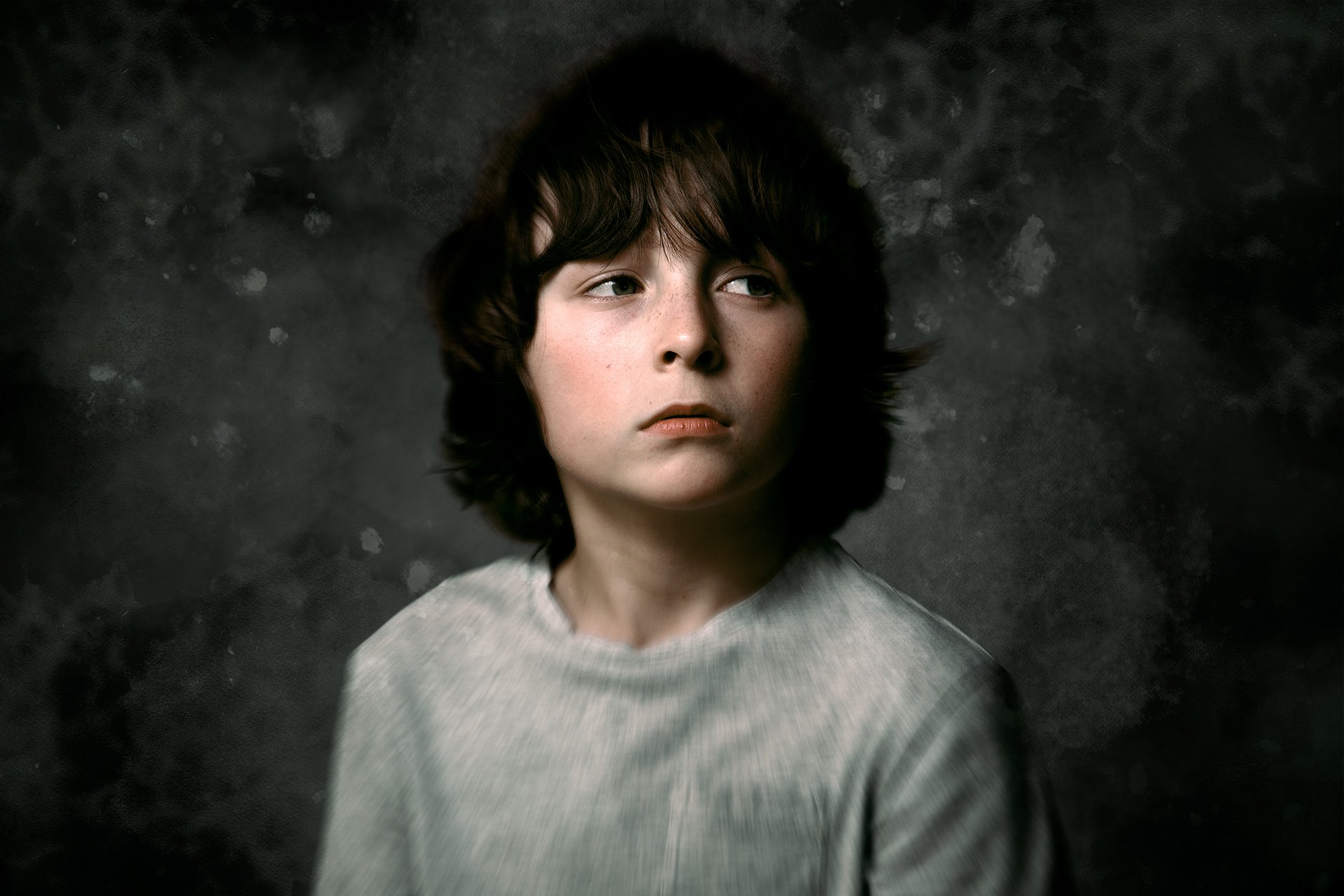
For this image, I started off in Lightroom and pulled down the saturation of the oranges quite dramatically. I do this in Lightroom because the Hue/Saturation adjustment layers in Photoshop do not break down the colours to the orange range - only Reds and Yellows annoyingly!
Being able to isolate the oranges is something I really enjoy doing in my portrait edits - so for now, I need to do this in Lightroom as part of my workflow.
Next I imported the image into Photoshop and began by extending the canvas out slightly to the left. To fill in this area, I used one of my favourite tools, the Content Aware Fill tool, to interpret what should be in this area.
On a duplicate layer, I applied a Radial Blur filter to give the image that swirling effect. I masked this off the face and just kept it on the outer edge of the frame.
Then I added some grain to the image using the Filters Gallery to give it a film-like feel and a little bit of retouching was done to lighten up the shadows under eyes.
Again I used a mix of Hue/Saturation and Selective Colour layers to get the colour to where I wanted, and then numerous lightening/darkening layers to dodge and burn specific areas throughout the portrait. I finished it off with a softly feathered vignette to pull the eye inwards!

